Long story short
2025
Cut navigation steps by 50% and decreased time-on-task through more efficient data search
Lucid Genomics is a software that helps geneticists and medical doctors analyze complex genome data using AI to support faster and more accurate insights.
Role: I redesigned two core pages of the Lucid Genomics software, focusing on reducing friction and improving clarity in complex data workflows. I also redesigned and implemented the Lucid marketing website, and iterated on different concepts to improve how users understand Lucid’s value proposition.
Sector: Healthcare, software and website
Process: I collaborated with our medical doctor and geneticists to observe workflows, understand user needs, and prioritize challenges based on effort and value. For the website, I iterated on content and structure, then built it in Squarespace under a tight deadline. For the software, I observed usage, conducted interviews, explored design alternatives with developers, and delivered high-fidelity solutions.
Impact: In the software, the redesign reduced the steps to reach key analyses by enabling direct access from the homepage, improved data visualizations, and brought more clarity to complex workflows. On the website, the new design communicated Lucid’s value more effectively and gave co-founders confidence to share it with others.
Vision: Improve data access speed and cross-referencing to streamline analysis in the software, and build the website with a better tool to enhance layout and visuals.
Software Problems and solutions
The software has three main sections, Individual Analysis, Cohort Analysis, and Variant Explorer.
I identified some usability issues through team interviews and observations, prioritizing them by impact and implementation effort.
  • Key functions were hidden under expandable cards, making them hard to discover.
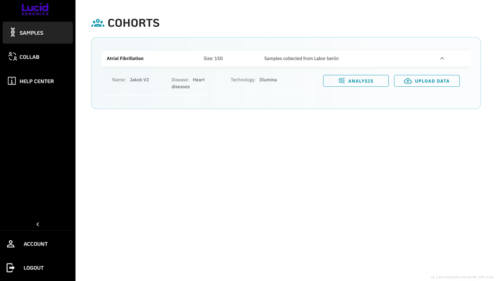
Previous version: It had hidden primary buttons and an extra step for analysis.
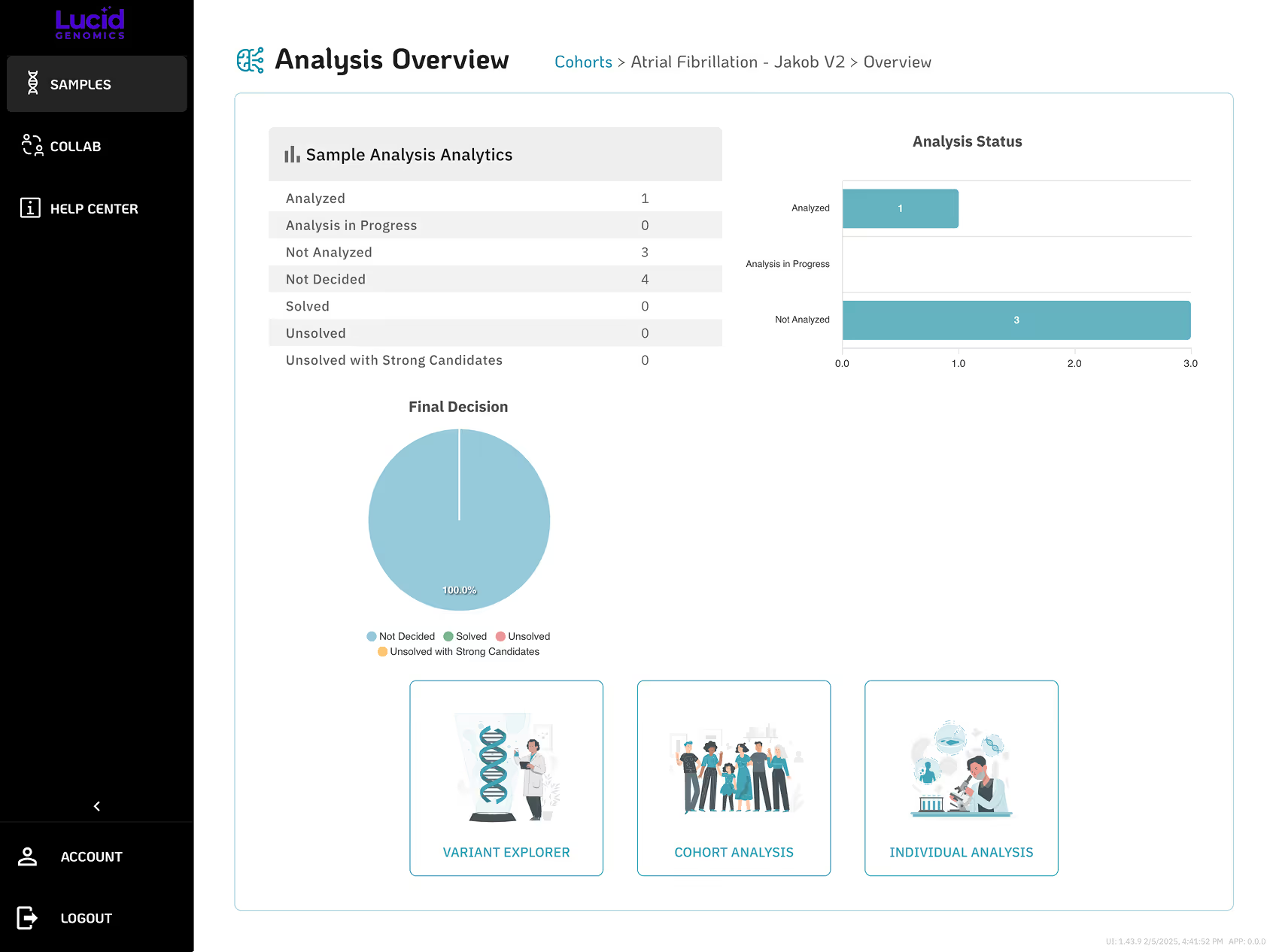
✅ Analysis and data upload needed to be front and center, always accessible, so I placed the three main analyses directly on the landing page to allow quick access.
  • Genomic data for a single family was scattered across different sections, so users had to cross-check data using separate Excel sheets.
  • Users needed to memorize patient IDs to locate related data in different tables.
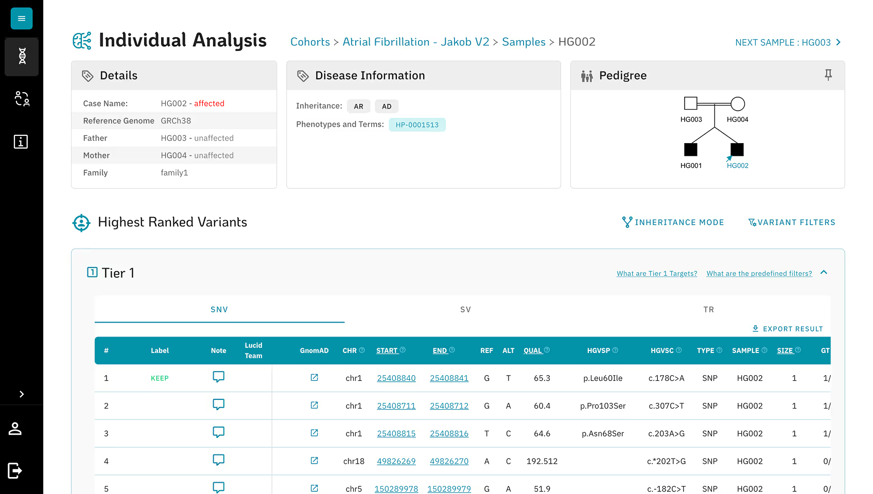
Previously version: Family data was only visible in the Individual Analysis section.
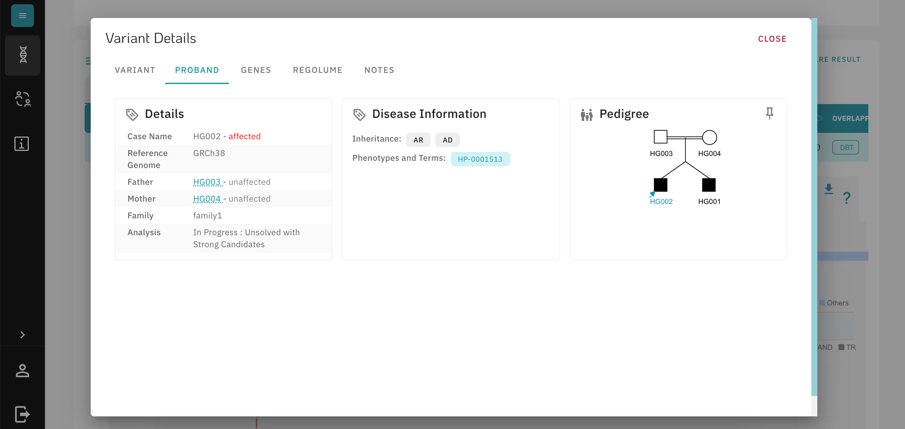
✅ Making family and individual patients' data intuitively accessible across the software by using modals. The redesigned version made family data accessible throughout the software, linked directly to variants for easier cross-reference.
Redesigned version: The modal makes the family data available across the software.
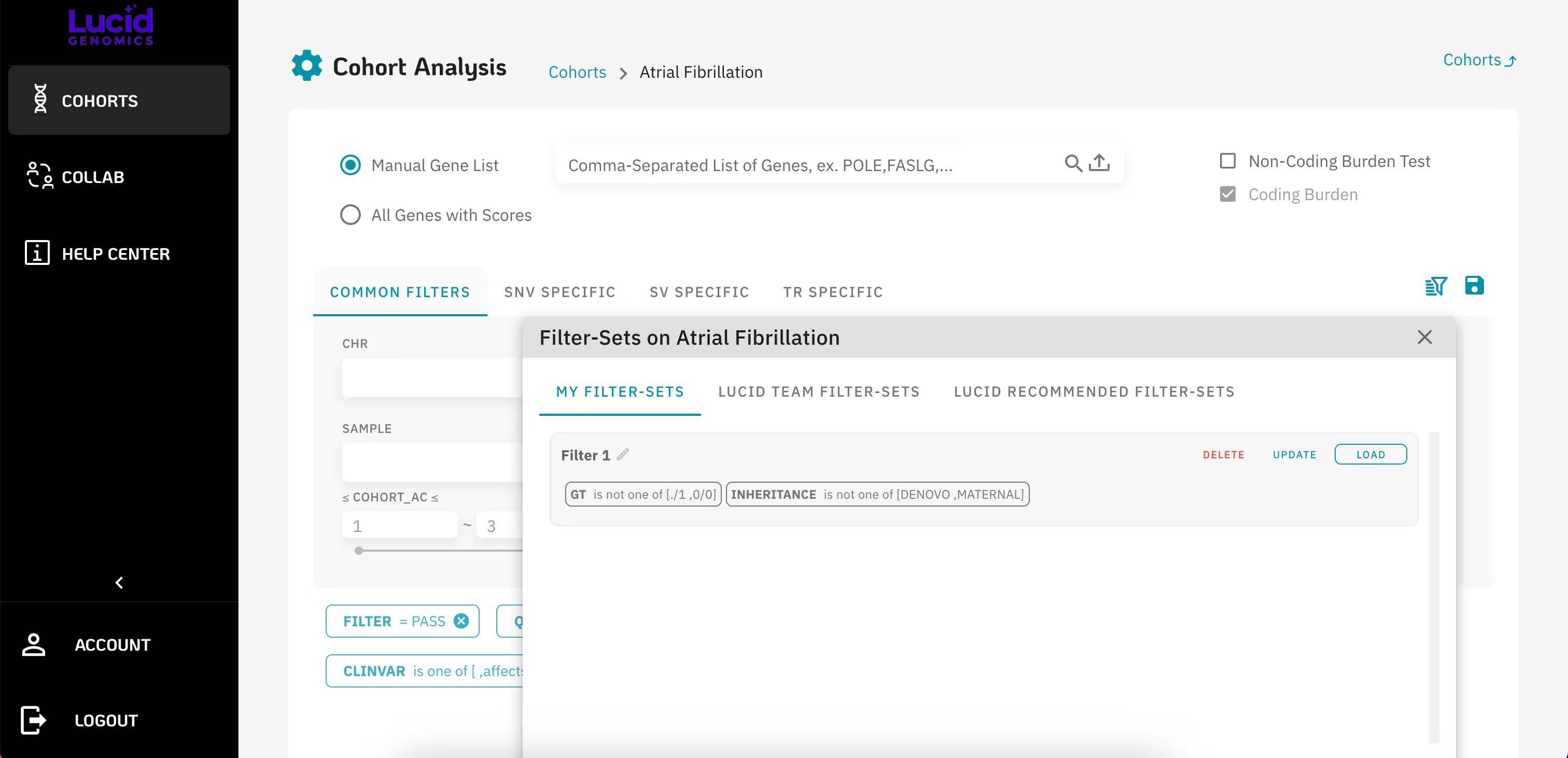
  • Although users needed to save filters to quickly access relevant data, the feature was rarely used due to its poor visibility and limited customization options.
  • Table search and filtering features were unintuitive.
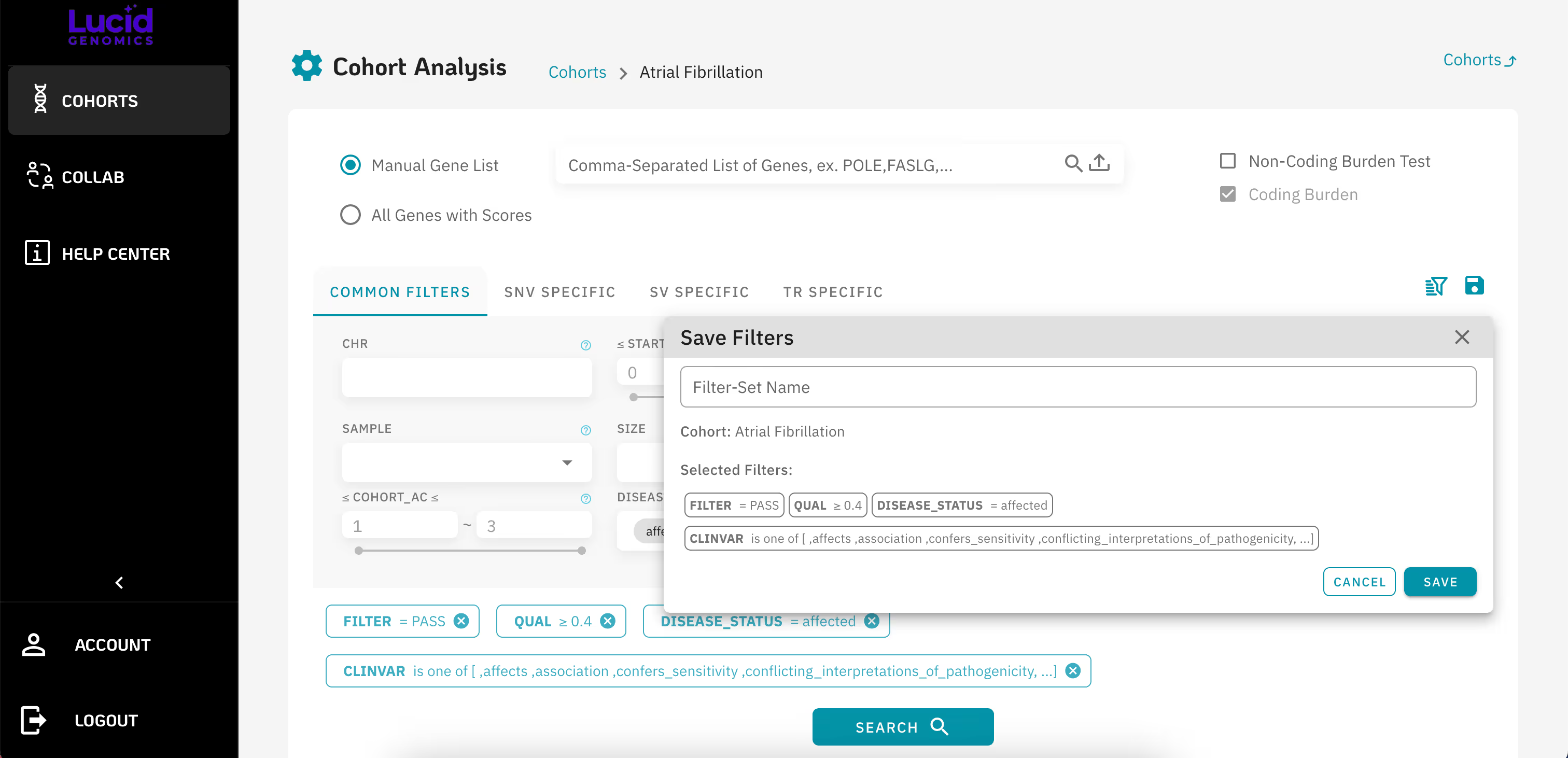
Previously version: Unclear save and filter features.
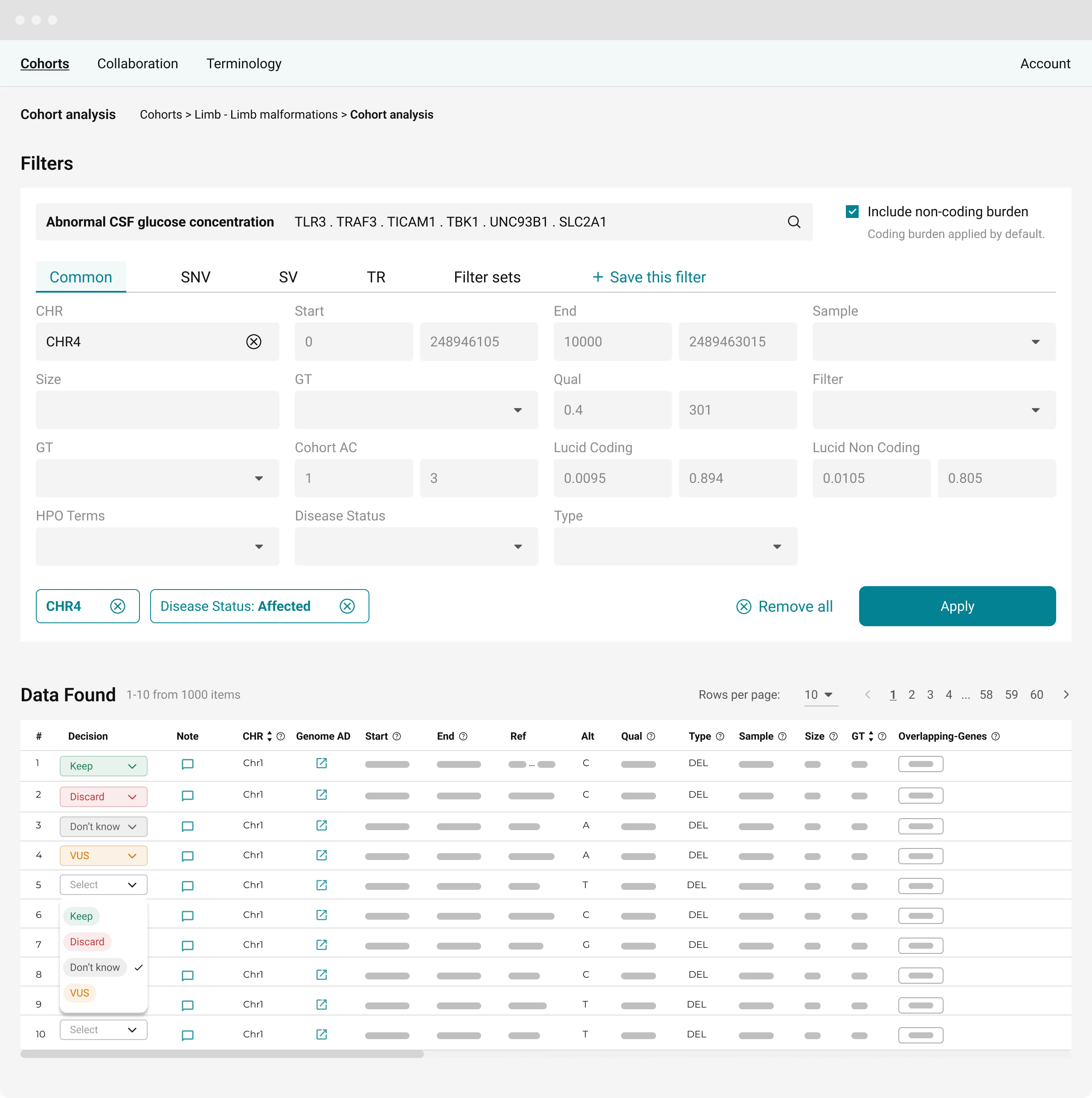
✅ Vague icons were replaced with clearly labeled tabs placed next to other filters, making the feature more intuitive. Users can now choose from preset filter sets or save their current filter configuration for easy access later.
Redesigned version: Filter sets and Save this filter features beside other filters.
Under NDA. Contact me to learn more.
  • Several smaller UI issues that, if addressed, could significantly improve the overall experience.
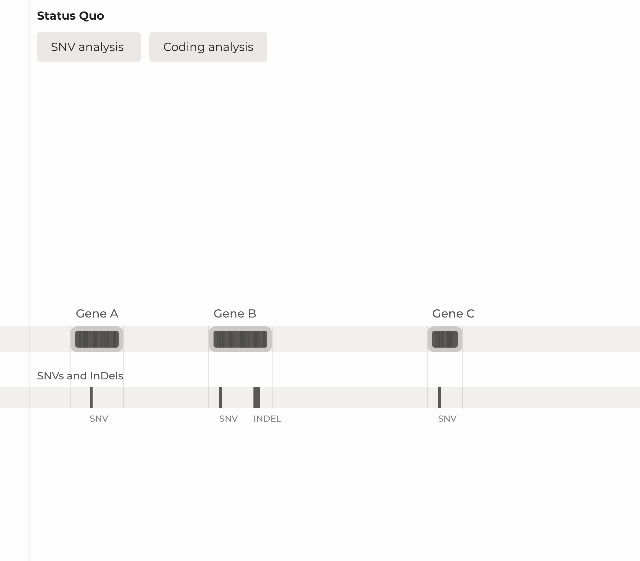
Replaced the typeface (IBM Plex Sans) with Roboto for improved legibility and readability. To ensure numerical data was easy to read, Roboto Mono was used for tables and metrics.
✅ Because the software needed to display large volumes of data in limited space, I chose a condensed typeface with a high x-height to ensure legibility even at smaller sizes.
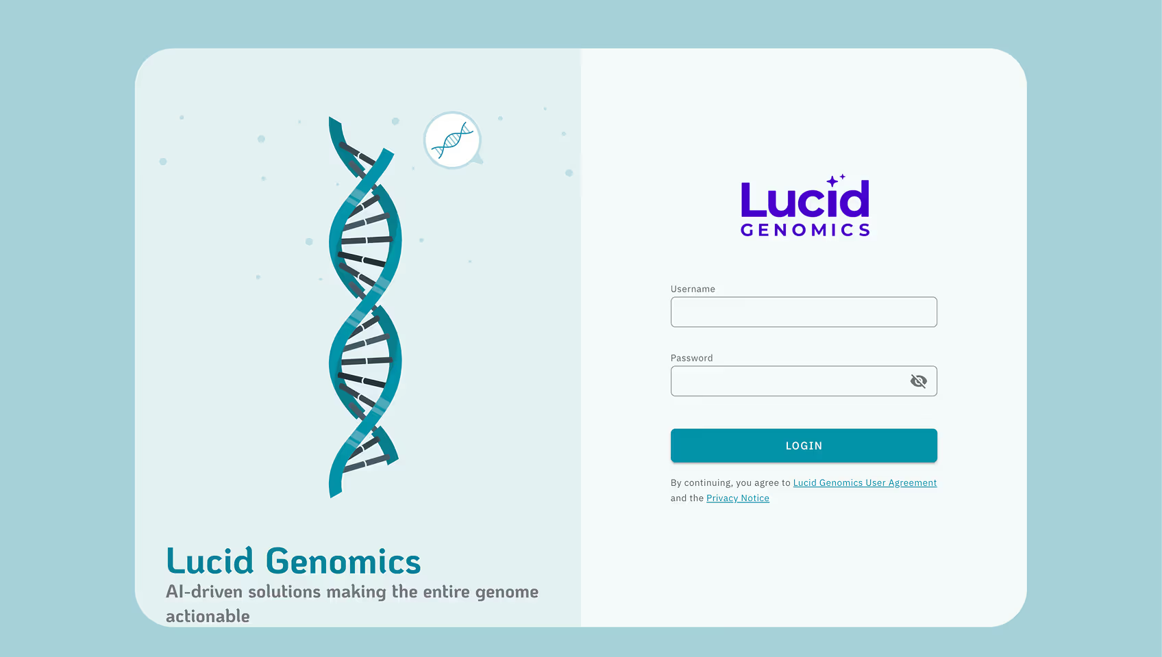
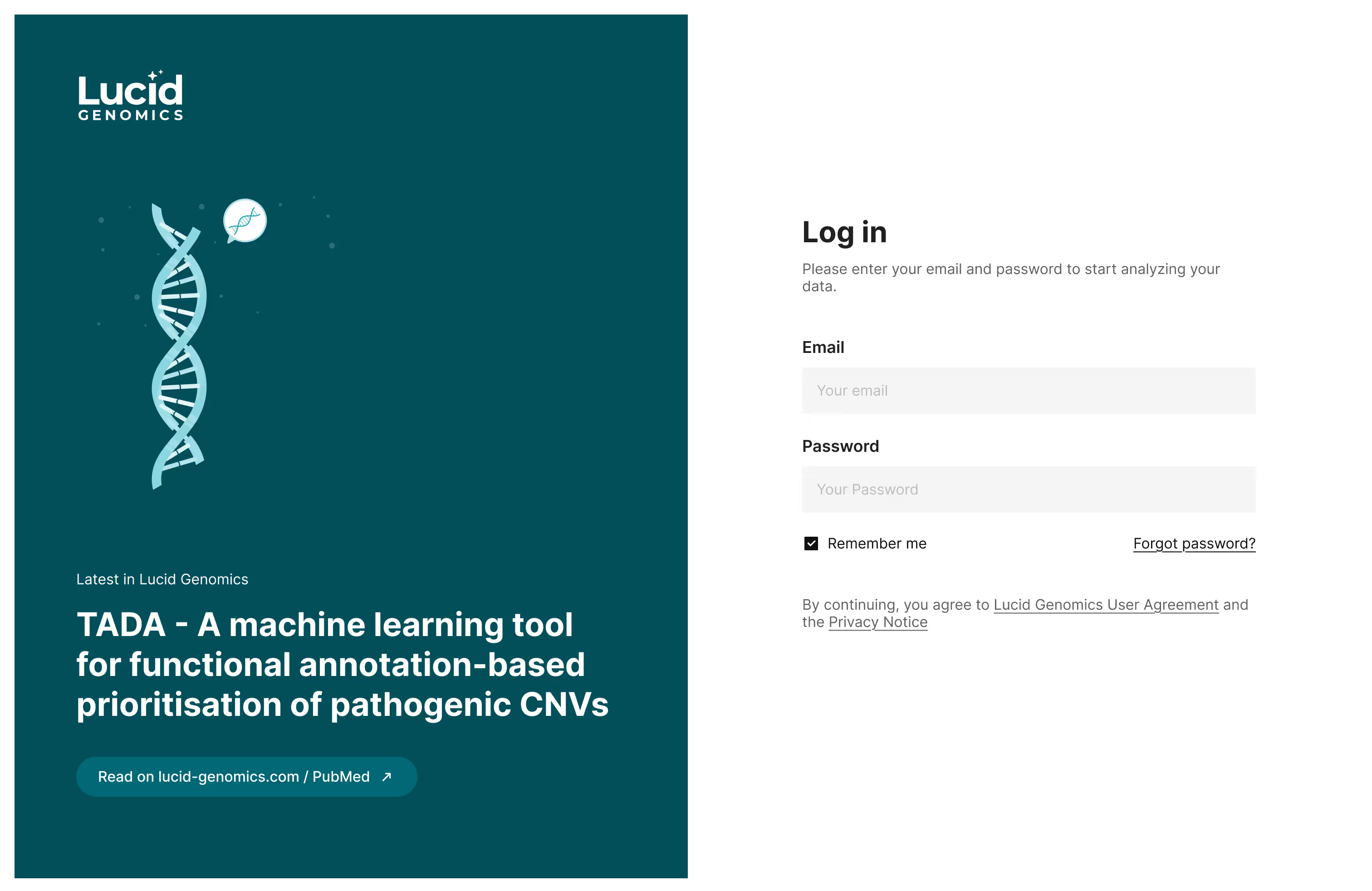
✅ Improved the login page for better visual consistency and a more professional appearance.
Previous version: Inconsistent & static.
Redesigned version: Dynamic with the latest content from Lucid blog.
Below, I explain the key challenges I encountered and how I addressed them.
Challenges
During this project, I encountered two main challenges, which I will elaborate on below.
#1 Unfamiliarity with the subject matter
Lacking a genetics background made it hard to grasp domain terms and separate real user issues from my own assumptions.
✅ Collaborated with experts and used GPT to understand genetic concepts
✅ Asked targeted questions to reveal deeper usability issues
✅ Observed real user behavior to uncover true workflows and goals
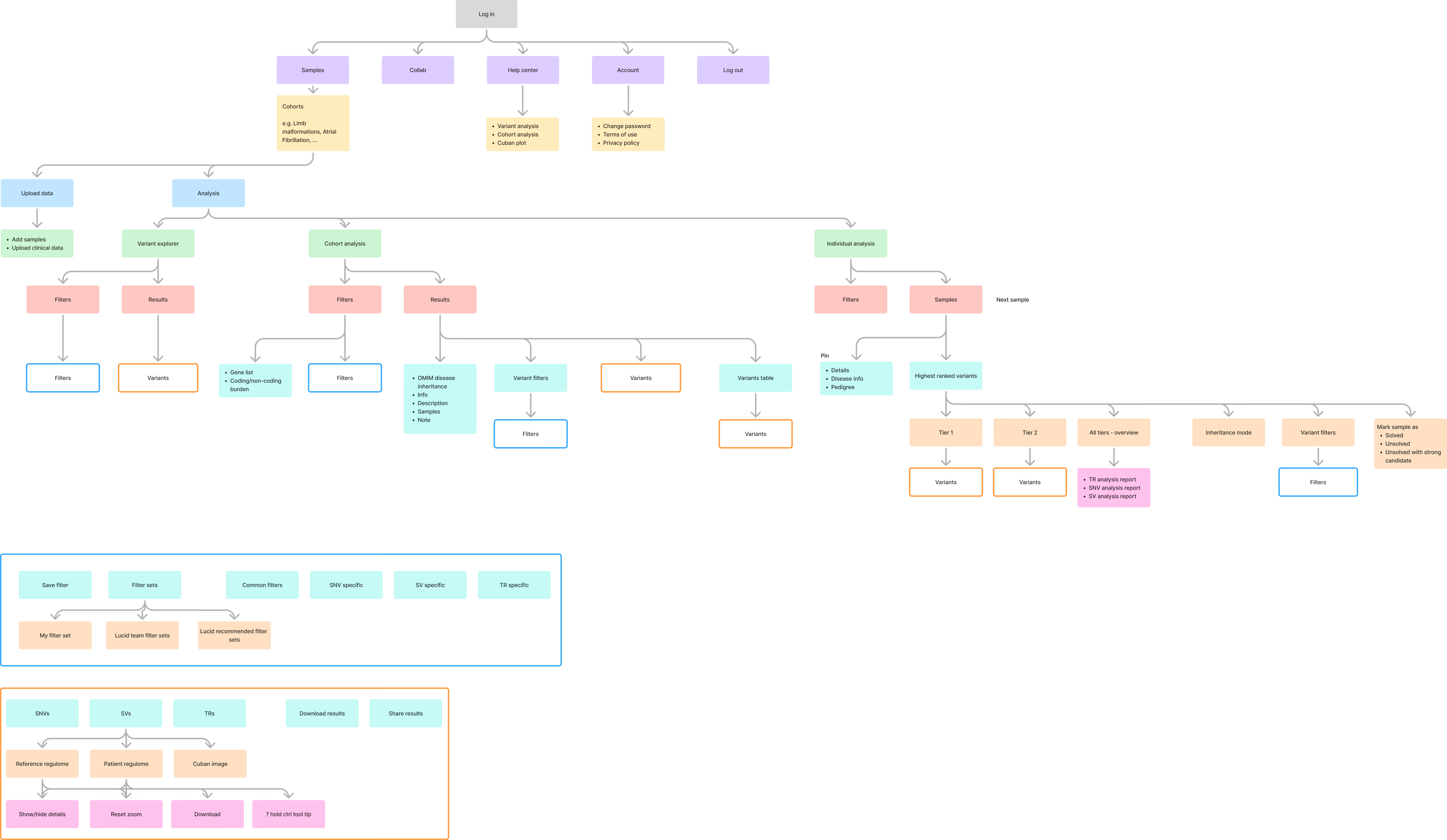
#2 Vast Information Architecture & Complicated User Flows
The software handled a high volume of genomic data, deep and layered content, making navigation and orientation challenging, especially with different user groups following distinct workflows.
Information Architecture: Complicated with some repetitive modules.
Under NDA. Contact me to learn more.
✅ Observed real user behavior and explore diagnostic and research workflows, to uncover priorities and map distinct user journeys for doctors and researchers.
✅ Simplified navigation and restructured the interface by removing bottlenecks and aligning it with users’ key goals.
User flows: Different user groups go through different flows.
Under NDA. Contact me to learn more.
Impact
Redesigning the software brought significant improvements in usability, clarity, and data accessibility for both researchers and clinicians.
Cut navigation steps by 50% by skipping an intermediate landing page.
✨ Improved accessibility and readability through clearer typography, better spacing, and higher color contrast
Reduced time-on-task by improving filter labels and layout, cut time spent searching for data.
✨ Family data was consistently available, helping users make better decisions.
Next Steps
With limited project time, key UX improvements were made, but there’s still room for further enhancements in future phases.
🚀 Establish a consistent design system for uniform UI.
🚀 Improve data visualizations for clearer insights.
🚀 Conduct usability testing to validate and refine flows.
Website Overview
The Lucid Genomics website introduces the product and hosts a blog for publications and events. The previous site had usability and clarity issues, so I gathered feedback from attendees at genomics conferences and the team to better highlight Lucid’s value and help users quickly grasp its benefits.
You can explore the website here.
You can also review the previous and redesigned versions in this Figma file.
Challenges
#1 Navigating Genomics Content
The website was highly content-driven, but team members had limited time to support content creation. Extracting accurate information was difficult, especially given the sensitivity and complexity of the subject matter.
✅ I began by extracting key content from the existing website and internal documents. Then, I organized and restructured it into a more intuitive flow. To ensure accuracy, I iterated closely with the team, especially on sensitive or technical topics, and used FigJam for collaborative content editing and validation.
The process
#2 Structuring Complex Information Clearly
Lucid Genomics is a novel product, even for experts like doctors and researchers. The challenge was to structure the website content so visitors could quickly grasp the value proposition and understand what the software does.
I studied other genomics software websites (e.g., Notos Genomics, Engenome, Genoox, SeqOne, Geneyx, Congenica) to learn how they present complex information.
After several iterations, I developed a website structure that makes complex ideas easier to understand. The website highlights two main pages:
Solution – This section clearly explains the challenges users face in genomics analysis and how Lucid Genomics addresses them.
Technology – This part breaks down the science behind the solution, showing the innovation and credibility of Lucid’s approach.
To build trust and provide depth, the site also includes a resources section featuring the latest articles, publications, and company news, as well as an about section to introduce the Lucid team.
I also placed CTAs throughout the site to drive engagement, including options to book a demo, subscribe to the newsletter, and contact the team directly.
The redesigned website focused on clear content and intuitive structure. The landing page gave a brief overview, with each section linking to deeper content.
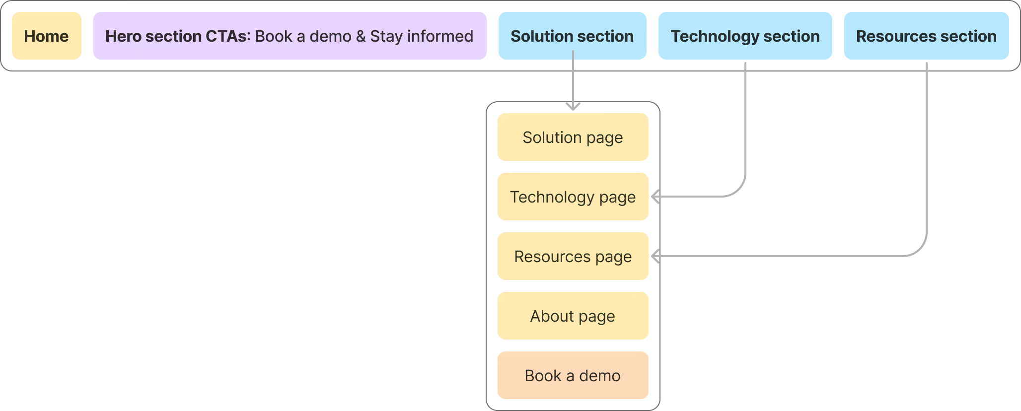
Website information architecture: brief overview on the homepage, details on inner pages.
In earlier iterations, the Product and Why Lucid pages were separate, which led to confusion and cognitive overload. We resolved this by merging the two into a single, well-structured Solution page that delivers a clear, unified message, helping users better understand and navigate Lucid's offering.
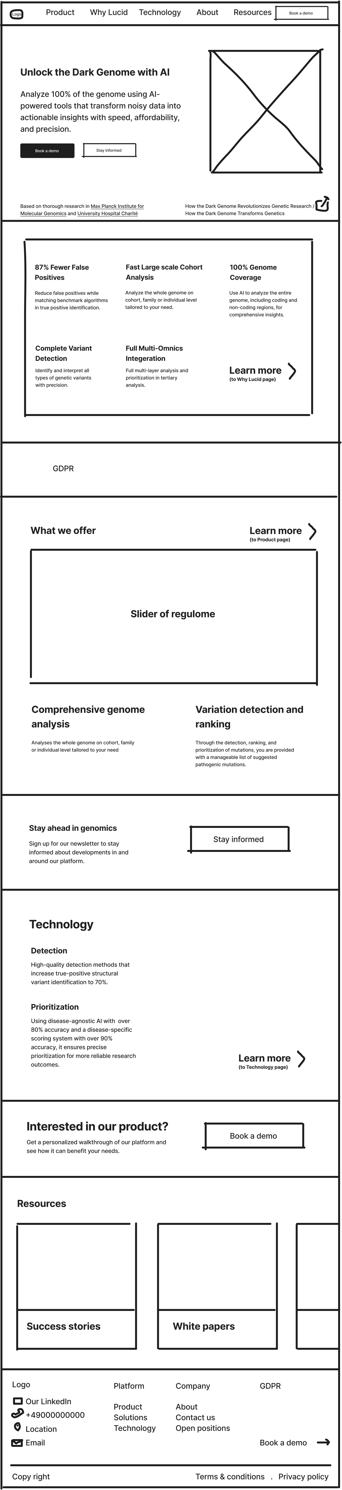
Home page
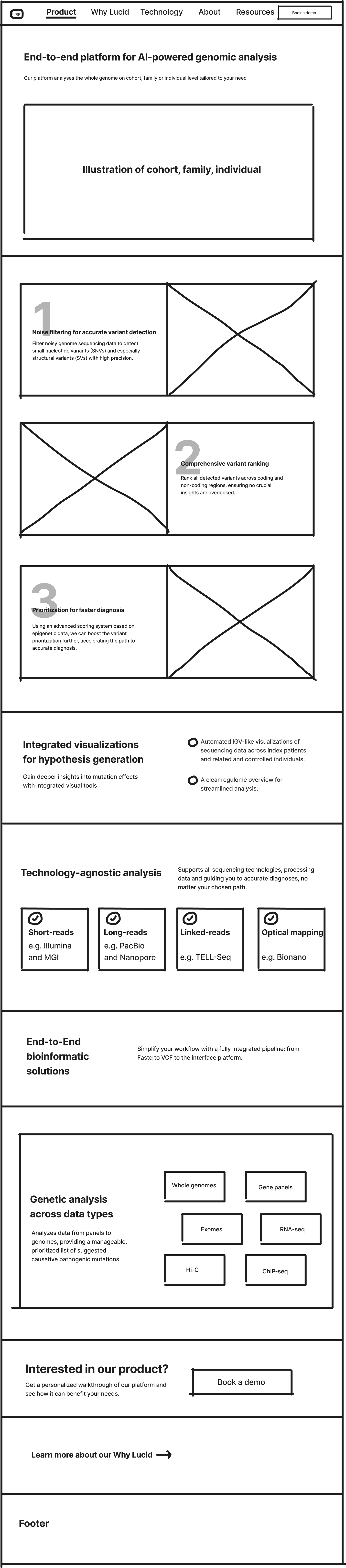
Product page
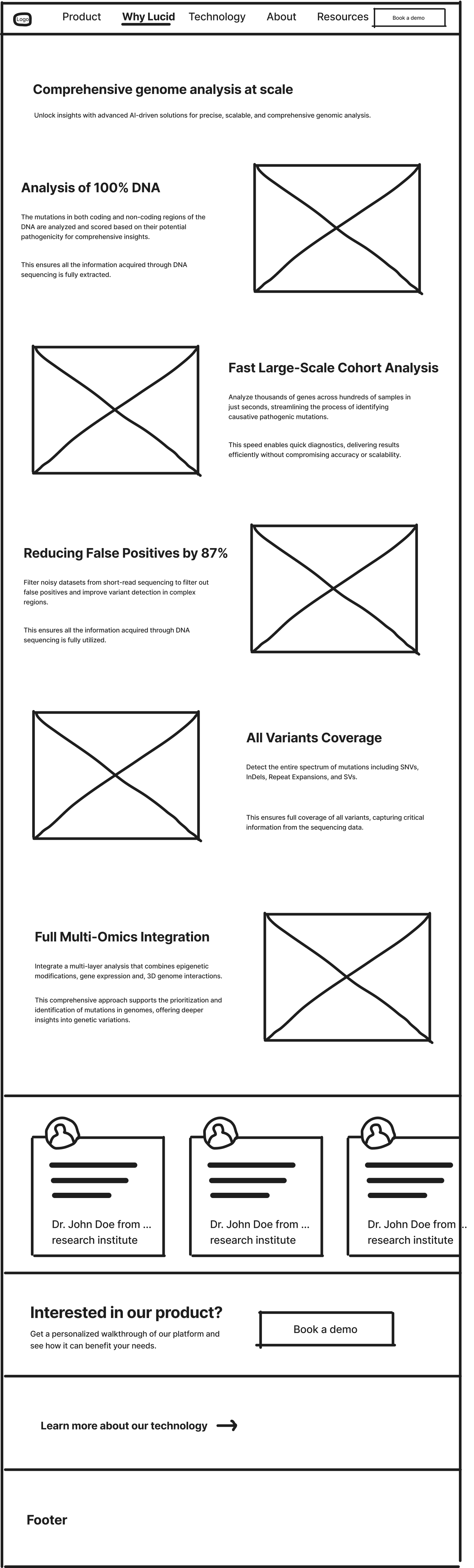
Why Lucid page
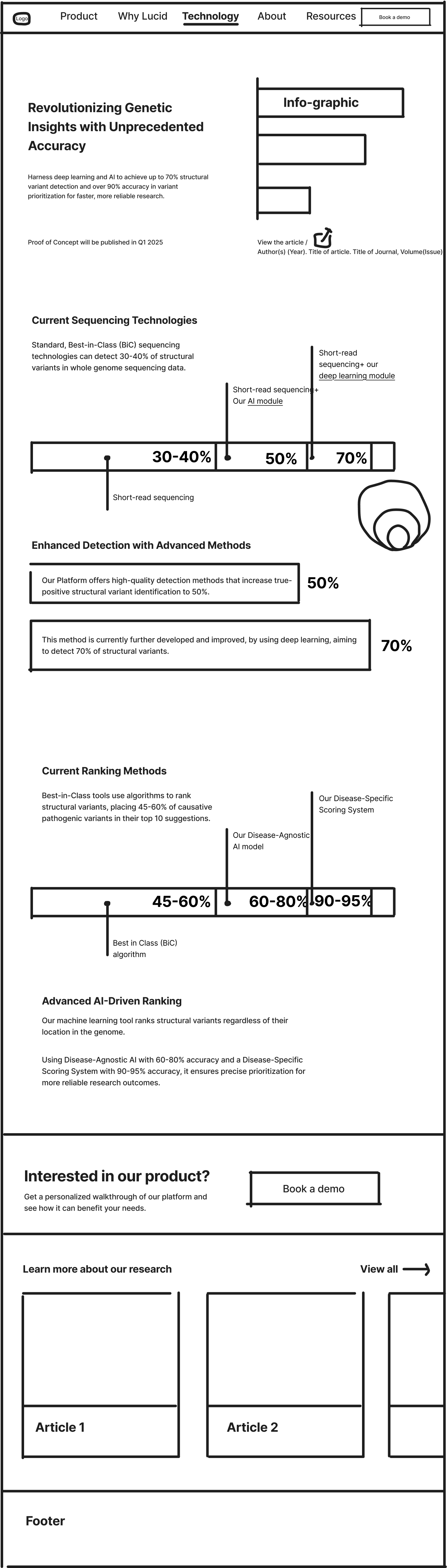
Technology page
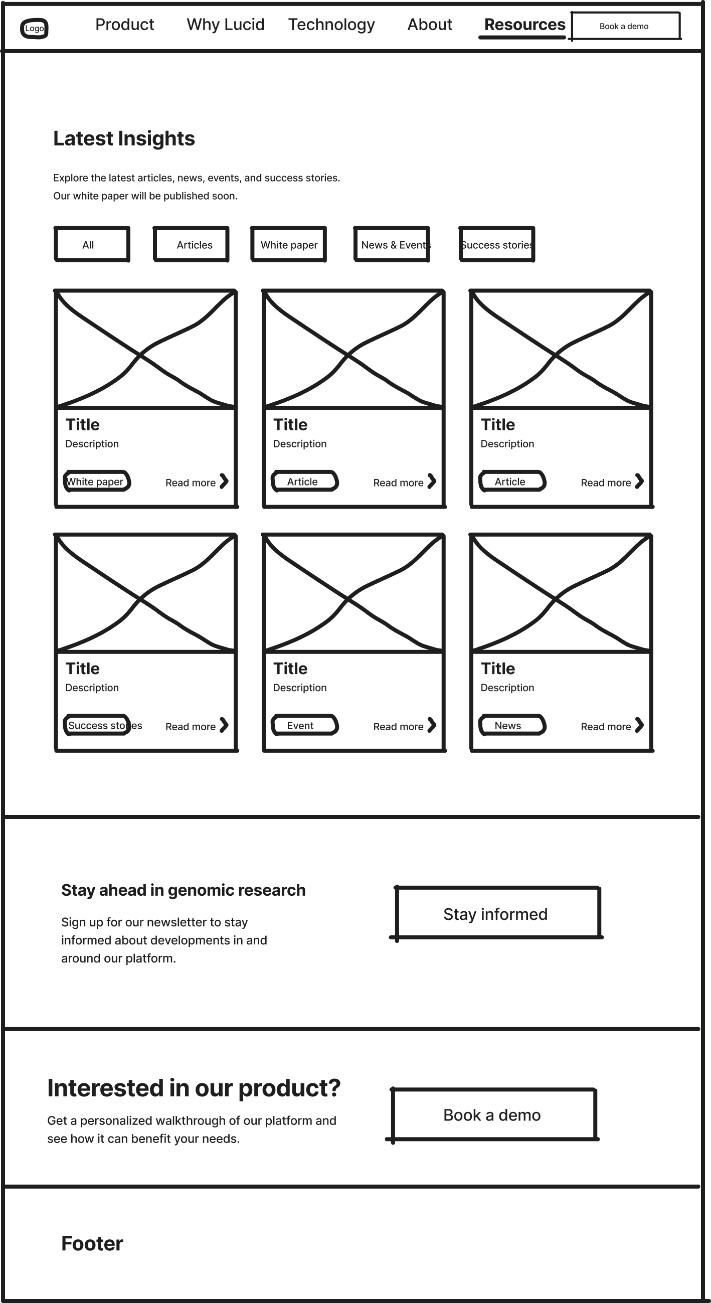
Resources page

About page
#3 Text-Heavy Layout Made Scanning Difficult
The website required a large amount of detailed content to explain a complex and innovative genomics product. However, the initial layout made it hard for users to quickly scan and absorb the information.
Instead of cutting down on content, I focused on improving how it was presented. I created supportive illustrations, added visual breaks with CTAs and lightweight sections like “Our Partners,” and used whitespace strategically to improve pacing.
Interactive elements were introduced to make complex concepts easier to understand. The overall layout was redesigned to guide users through the information step by step, without overwhelming them.
First Image
◀ ▶
Interactive element showing the Lucid competitive advantages.
#4 Platform Limitations, Using the Wrong Tech Stack
The previous website was built on Squarespace, which wasn’t suited for a complex website like Lucid’s. The platform offered only basic layout tools and extremely limited customization, making it difficult to implement a tailored design that met both UX and branding needs.
However, switching platforms wasn’t an option, the team had already committed to Squarespace, and the website had to be ready in time for an upcoming genomics conference.
In addition, the website needed to be easy to maintain and update without requiring a designer or developer, so choosing a simple tech stack was intentional.
✅ Despite the limitations, I adapted the design system to fit within Squarespace’s constraints. I prioritized layout decisions that worked within the available modules and focused on clarity and hierarchy over advanced interactivity.
✅ I also optimized content structure to reduce visual noise and ensured the design looked professional and consistent, even within a restricted framework. This allowed us to launch on time without sacrificing user experience.
#5 Accessibility Issues, Poor Color Choices and Contrast
The previous website used too many colors with low contrast and fully saturated hues, which made it difficult for users with visual impairments to comfortably read and navigate the site. The excessive and inconsistent color palette also distracted from the content and brand focus.
✅ To enhance accessibility and visual coherence, the color palette was limited to warm gray and purple as primary brand colors, with teal as an accent (maintaining harmony with the software’s original primary color).
✅ A darker, desaturated tone of the brand purple was chosen and reserved exclusively for primary buttons and key interactive elements. This increased color contrast, enhanced readability, and created a more professional, accessible experience for all users.
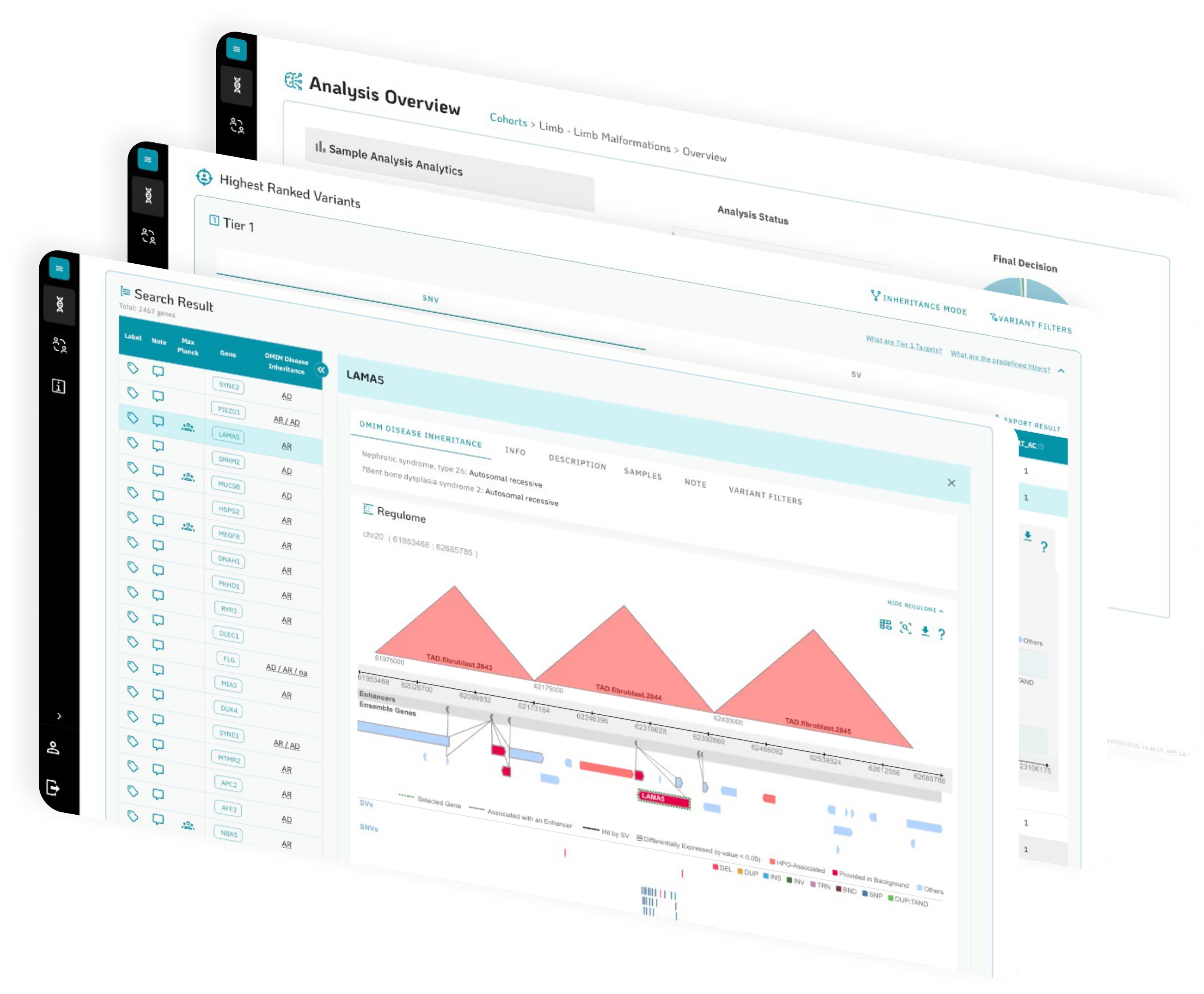
💡 Some software screenshots are shown in isometric views, which can make the details hard to read. This was intentional, the team wanted to demonstrate that the software is functional without revealing sensitive or detailed information.
Previous colors
New colors
Intentional isometric
Impact
After redesign, the website became more clearly structured, accessible, intuitive, and aligned with user needs. The impact is felt in every interaction, even if not easily measured.
Clear Value Communication
Lucid’s value propositions were distilled and presented in a way that resonated with both experts and newcomers. The website made complex technology feel approachable and relevant.
Confidence for Co-Founders
A clean, structured website gave the co-founders a strong foundation to present Lucid to investors, partners, and users. It elevated the brand’s credibility and professionalism.
Structured for Clarity
Using the inverted pyramid approach, the most important information was surfaced early. This guided users through a logical, digestible flow of content that encouraged deeper exploration.
Next Steps
While the redesign significantly improved content clarity and structure, there’s still room to elevate the user interface.
Switch to a more customizable stack
Using tools like Framer or Webflow to enhance UI flexibility and design precision.
Add filters for blog posts
To improve content discoverability, something not supported in Squarespace.
Introduce success stories
To showcase real-world impact and build trust with potential users.
Other
works