Long story short
Aug 2024 – Feb 2025
Increased conversion rate and cut time-to-resolution by improving the ordering process,  a web app built with Softr and Airtable
Fixit is a web-based platform that connects customers with handypeople for remote household repairs via video calls. It provides fast diagnoses, tool recommendations, and flexible earning opportunities for handypeople.
Role: I led UX and product design, ran usability tests, and iterated the MVP to improve customer conversion and handypeople efficiency.
Sector: Household repair services, Web App
Process: Gathered insights from research, tested early ideas with a Telegram chatbot, defined user flows, created wireframes, built an MVP with Softr and Airtable, and developed a more detailed prototype in Figma for further testing and iteration.
Impact: Streamlined customer case submission, improved AI-generated diagnoses and tool lists, and simplified the workflow for handypeople, by rebuilding the platform from a Telegram chatbot to a Softr web app powered by Airtable, informed by UX research and usability testing.
Vision: Minimize back-and-forth between handypeople and customers by improving the case submission flow, streamlining the diagnosis process, and enhancing AI-generated suggestions.
Problem
Through user interviews and testing, I identified users' needs from both customers and handypeople.
Handypeople
  • Unclear issue descriptions
  • Missing tools and parts
  • Scheduling conflicts
  • Unrealistic customer expectations
  • Unfair ratings
Customer
  • Hard to explain issues
  • Tool confusion
  • Poor coordination
  • Mismatch in expectations
  • Doubt in remote fixes
  • Unclear pricing
Challenges
During this project, I encountered 4 main challenges, which I will elaborate on below.
#1 Aligning handypeople and customers’ user flows
While designing the user flow, several key questions arose. I explored each of these questions in depth to find the most efficient and user-friendly solutions.
How should we match customers with handypeople?
The handyperson receives the request, accepts it, and writes the diagnosis.
The customer receives the diagnosis and a list of tools and parts, and then can book a call.
Receive the requests
Accept the job
Submit an order and receive the diagnosis
Book a call
How should requests be sent to handypeople? And how many active requests should a handyperson be allowed to manage at the same time?
How can we ensure that no more than one handyperson is working on the same case simultaneously?
Handyperson can have 3 active requests, to make sure they put enough time on each. The job will be back in the pool if they don't provide a diagnosis in a specific timeframe.
3 active requests
Disabled new requests
On-hold jobs: waiting for the customer to book a call or respond
At what point in the flow should the customer be asked to log in or sign up, or pay?
Delaying sign-up and payment until the end of the flow increased conversion. Sign-up was incentivized by offering a detailed diagnosis and tools and parts list. Payment was only processed after the call, reducing friction and building trust.
Sign up / Log in
Receive a diagnosis afterwards
Add payment method
Final confirmation
How should the call with the handyperson be arranged, through a scheduled booking, or as an instant call?
I simplified availability by removing the urgency tag and instant bookings, which didn’t align with our users’ needs. Handypeople now have time to review each issue, and customers can prepare tools and parts. Calls can be booked within the handyperson’s available time slots.
Set availability
Order details & book a call
Select date
Select time
#2 Ease of Use for Customers vs Information Needs for Handypeople
Customers prefer fast, minimal input when submitting issues, often omitting technical details, while handypeople require comprehensive information to provide accurate diagnoses, creating a mismatch in expectations. I explored some solutions to tackle this challenge.
Direct messenger for handypeople to gather more info
→ Too time-consuming for handypeople before the customer commits to paying
→ Risk of communication moving outside the app
Hybrid question flow (multiple choice + free text) for the MVP
→ AI asks any additional questions needed for an accurate diagnosis
Follow-up question feature
→ Allows handypeople to request more info when necessary, without enabling direct chat
To address this, we asked tailored, case-specific questions to reduce irrelevant inputs while ensuring the information was detailed enough for handypeople to make an accurate diagnosis.
Ask follow-up questions
Multiple choice
Free text
#3 Limited access to handypeople
We only had one handyperson available for testing, which limited the variety of feedback. Instead, a different research and testing approach was chosen to continue progress despite limited access. I decided to use these channels to extract insights:
Quora: Search for questions related to DIY repairs, challenges in hiring handymen, or frustrations with current home repair options.
▶️ YouTube: Analyze comments under DIY repair videos where users express what was difficult, what was missing, or what they needed more help with.
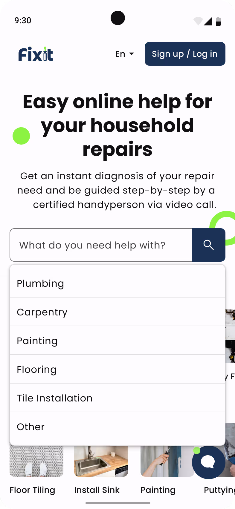
📱 App reviews (Competitor analysis): Review platforms like TaskRabbit and Thumbtack on app stores or forums to gather pain points and feature suggestions from users. Most competitor platforms focus on on-site services and struggle with high commissions, slow background checks, poor job-skill matching, rigid pricing, rating penalties for cancellations, and a lack of user-centered design and transparency.
I reviewed household service apps (TaskRabbit, Co-Tasker, Angi, MyHammer, Helping, Thumbtack), health chatbots (Ada Health, Wysa, Woebot, Replika), and service platforms (Uber, Bolt) to understand patterns in service delivery, user experience, and chatbot integration.
#4 No-code platforms limitations
A simplified version of the app was built using Softr, a no-code platform, and Airtable for the database. This version allowed us to test the product, gather insights, and iterate quickly.
With our current Softr plan, we were limited to just one user group.
👉 So, we chose to treat handypeople as users and manage the customer side via forms and email. We automated processes using Airtable and Make.
🖥 Softer had limited customization—only a few options for button actions, layout, and logic. For example, Handypeople had to copy the AI-generated diagnosis and paste it into a separate text box, instead of editing it directly. This made the process confusing and unnecessarily time-consuming.
✅ As a workaround, we applied UI tricks to mimic our intended design.
You can check out the initial version of the customer side here!
Job details - V1
Job details - V2
Job details - V3
Write diagnosis
Jobs & Calls
Design
I focused on designing for mobile first, considering two key points: which features users access most frequently and which require the most attention.
Design Decisions & Thinking Process
Putting the 2 most important features -New Requests and Upcoming Calls- on the landing page and highlighting the ones that need immediate attention.
Simplifying the availability setup and removing the instant availability because Fixit doesn't support the urgent cases.
Ensuring informed decisions before actions by removing instant “Accept” and “Join Call” buttons from job cards.
Adding labels and an arrow button for cards to show details, to improve the usability for non-tech-savvy users.
Limited one request per handyperson and added time limits to boost response speed and reduce conflicts.
Removed direct messaging and added a follow-up question feature to reduce the time burden and support better answers.
Displayed essential job details upfront, keeping interfaces clean and avoiding information overload.
Simplified the schedule view to just a list view since handypeople tend to plan short-term only.
Final Design
Design Decisions & Thinking Process
Communicated Fixit’s service scope clearly on the landing page so users know instantly if the service fits their needs.
Placed chatbot entry points directly on the landing page to capture interest and increase engagement early.
Delay the sign-up prompt until after users describe their issue, lowering initial friction and boosting conversions.
Motivated sign-up by offering a detailed diagnosis and tools/parts list as a reward after registration.
Ensured customers only pay after the call, which builds trust and reduces friction in the decision-making process.
Used tailored chatbot questions to show how Fixit uniquely addresses customer problems and sets itself apart.
Allowed users to complete issue descriptions without logging in, as long as the browser tab stays open, preserving progress.
Redesigned the AI chatbot to ask fewer, more focused questions, with the ability to go back or edit answers before submission.
Final Design
Impact
From a simple chatbot in Telegram to a functional MVP and advanced design, Fixit evolved through many iterations. Like most startups, it required continuous improvement. While the impact may not be easily measurable, it is undeniably tangible.
Bridged the gap between customer simplicity and professional accuracy
Developed a tailored chatbot and hybrid input method that simplified issue reporting for customers while ensuring handypeople received the detailed information needed for accurate diagnoses, balancing usability with information depth.
Enabled usability despite platform limitations
Worked around no-code constraints (Softr, Airtable, Make) by designing creative UX/UI solutions, such as single-user architecture with workaround flows, and mimicking custom interface elements that weren’t natively supported.
Improved handyperson efficiency in writing diagnoses
Identified pain points in writing diagnoses, especially on mobile, and introduced improvements like expandable input fields, structured formats, and better AI integration to reduce effort and improve accuracy.
Designed scalable and structured user flows
Mapped and aligned the workflows of both customers and handypeople across booking, diagnosis, and calls, answering critical questions around matching, timing, and communication to support smooth, scalable operations.
Conducted lean UX research with real-world constraints
Overcame limited access to handypeople and language barriers by leveraging indirect research methods (Quora, YouTube comments, competitor reviews), extracting valuable insights to inform design without formal user studies.
Next Steps
Although the MVP provided valuable insights and functional workflows, there’s still room to enhance the overall experience for both customers and handypeople.
Improving the conversion rate after receiving the diagnosis
Many users dropped off after receiving the diagnosis and tool and part list. This stage needs better engagement and motivation to proceed.
Further balance ease of use vs. information needs
Continue refining the flow so customers can submit issues quickly while still giving handypeople enough detail for accurate diagnoses.
Reduce the need for follow-up questions
Optimize the intake process to capture essential information upfront and minimize back-and-forth.
Want to learn more?
Interested in learning more about Fixit? Book a 30-minute call to explore the details and ask anything you'd like.
Book a Call
Other
works