Remove Doubts, Build Trust
To build trust, users need to understand where the recommendations come from, whether from their answers or past preferences. A more engaging onboarding flow can also help the AI get to know users better and suggest more relevant resources.
I used GPT-4o and optimized the prompts to ensure the questions were tailored to users’ needs, the number of questions was manageable, and the most important questions were prioritized to balance user effort with the information needed to recommend resources.
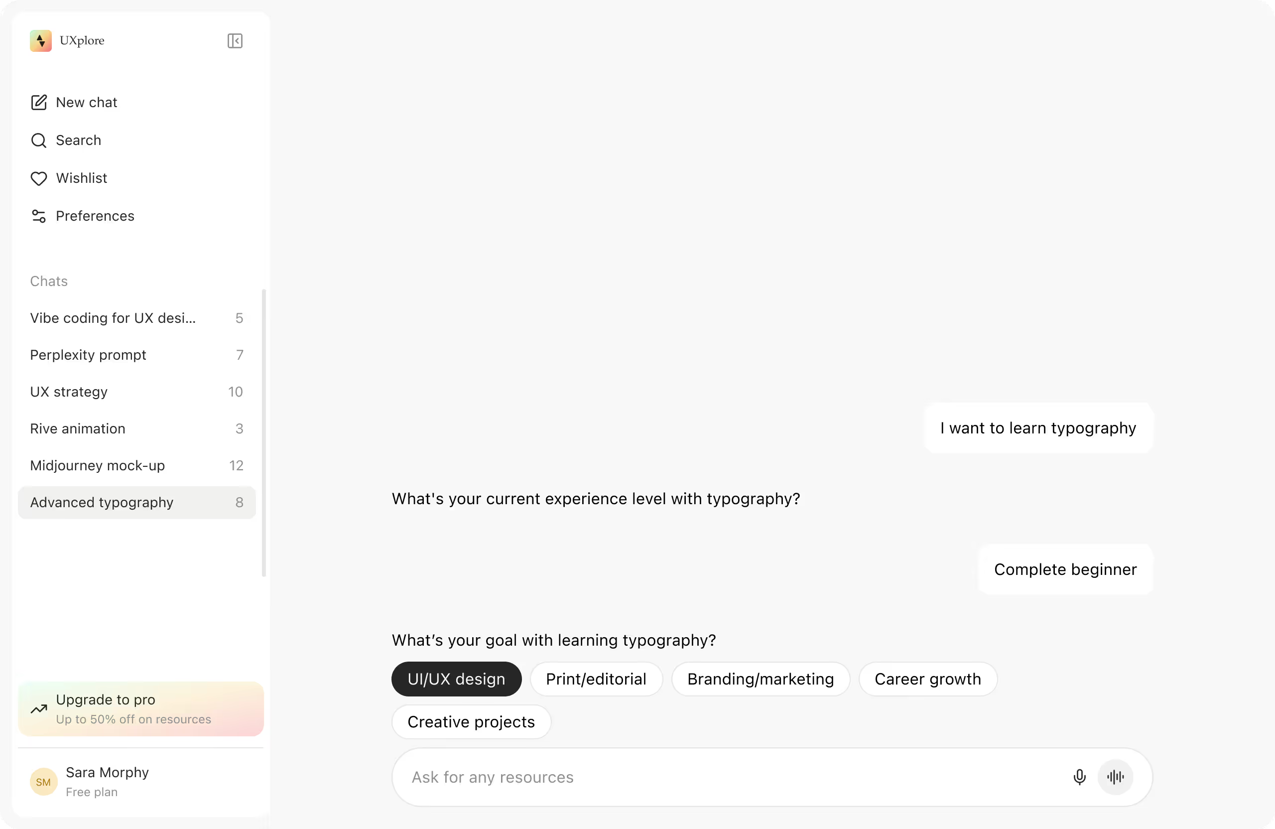
Chat interface - Tailored questions
How can users be sure that the suggested resources are really what they’re looking for? And how can they trust the recommendations?
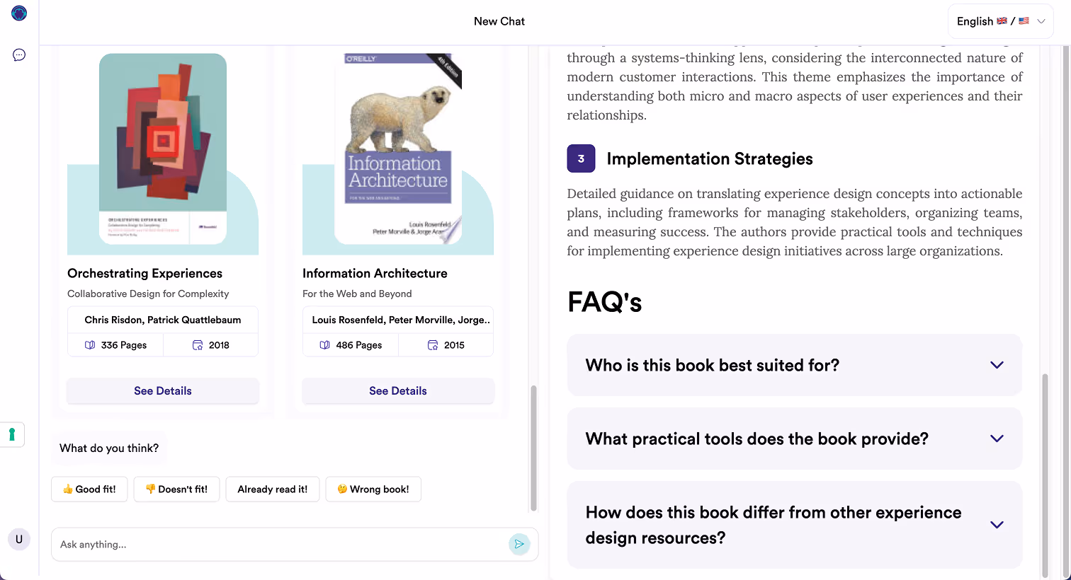
The key is transparency. By showing the reasoning behind each suggestion, why a resource was recommended, how it matches their preferences, and what information it’s based on, users gain confidence in the system. To support this, I added a reasoning section to each card along with a match score, making the AI’s decision process more visible and trustworthy.
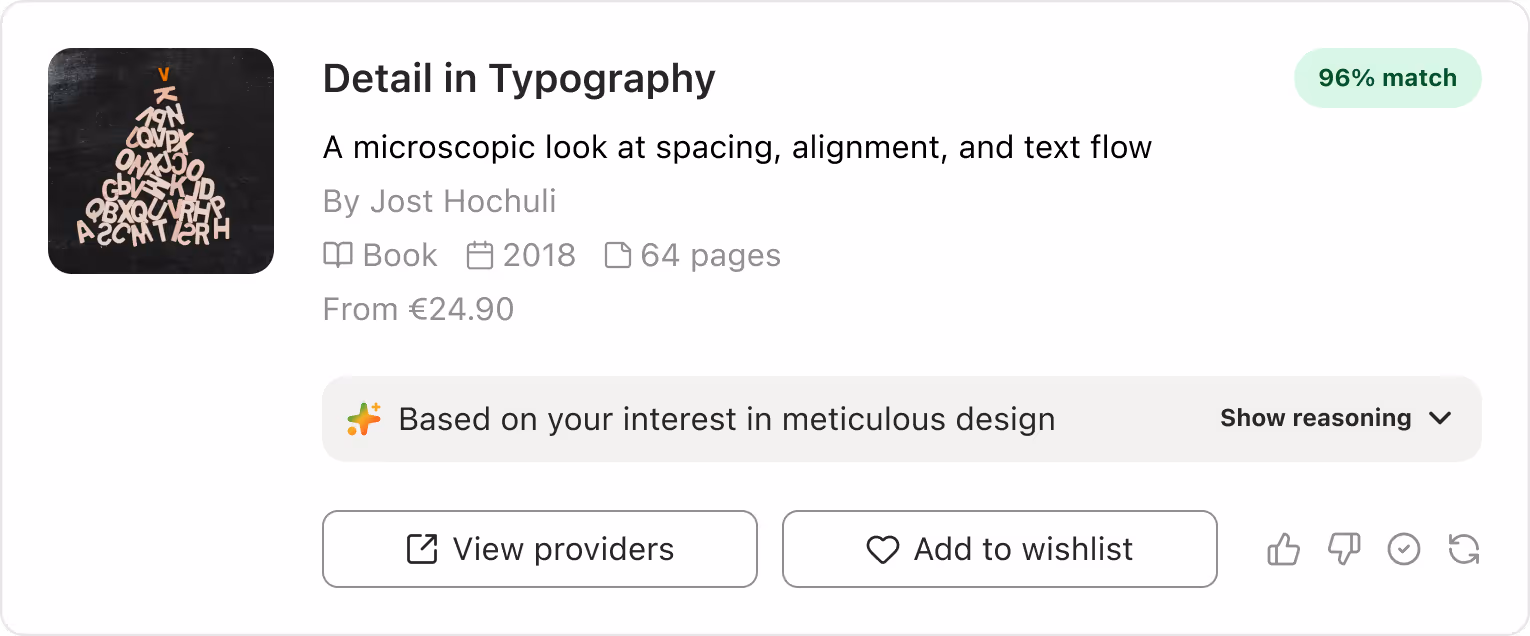
Book card - AI-generated reasoning and match score
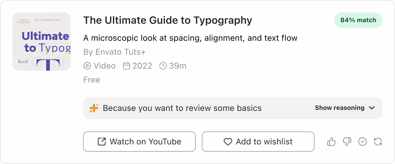
Clearer Info, Higher Confidence
I redesigned the resource cards to show the key details right away so users didn’t have to search elsewhere. Each type of resource (book, video, course, podcast, article) got its own layout with the most relevant info, such as page count, duration, or year.
I also added a direct link to the original source for anyone who wanted to dig deeper. This made decisions quicker, cut down drop-offs, and built more trust in the AI recommendations.
Vido card
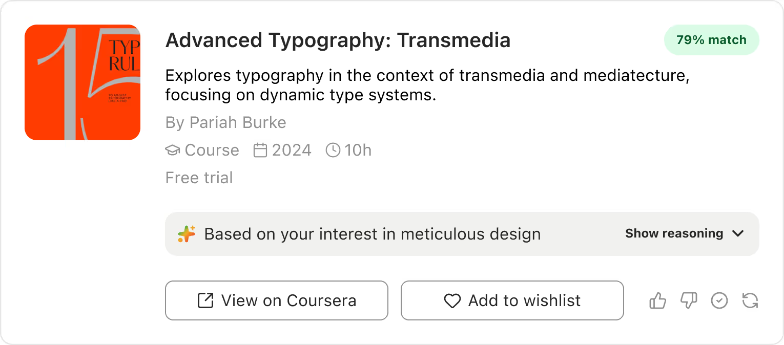
Course card

Article card

Podcast card
Letting Users Shape Their Experience
I added a memory feature that tracks users’ feedback history, preferences, and goals, and stores interaction logs in the database, including clicks, views, search queries, and session context. Users can also give feedback on each resource, like marking it as “dislike” or “already know,” and the AI will adjust recommendations accordingly.
This approach helps the AI improve over time while giving users a sense of control, letting them influence the outcomes and feel more autonomous in their experience.

Learning memory modal - Improving AI over time
Dynamic Feeling Through Motion
Use subtle motion to show that the content is being generated by AI in real time. This helps users understand that what they’re seeing isn’t pre-made, making the experience feel more transparent and trustworthy. It also makes the interaction feel alive and dynamic.
Book card - Dynamic AI-generated reasoning
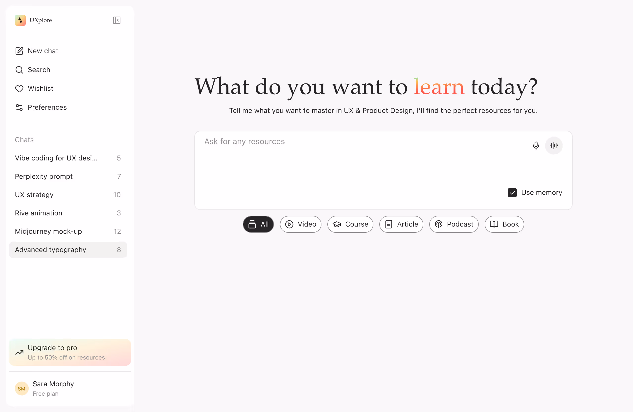
All Resources at a Glance
Users can add resources to a wishlist for future reference and see all the resources suggested in a single conversation. This makes it easier for them to track, compare, and revisit relevant information without losing context, helping them stay organized and focused.

Chat interface - See all resources in a conversation by clicking “View All Resources.”
The interface adapts seamlessly to different screen sizes, ensuring a smooth experience on any device.